A few interesting historical contexts of market corrections/bears…..
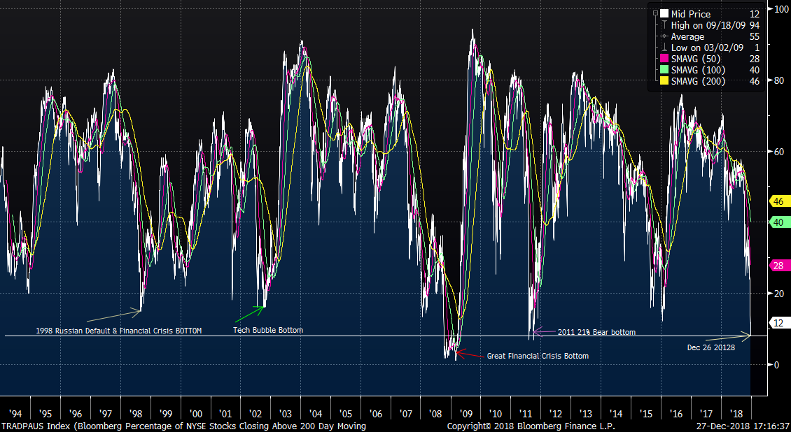
The header graphic shows the extreme level of capitulation that the markets have expressed through this week. This shows the percentage of stocks above their 200 day moving average. It is nearly as low as the GFC bottom and below all others. There is nothing magic about the number, but when put into historical context shows how this market action compares to previous extremes.
As of Tuesday Dec 26, the current market correction is the 5th fastest this century to a 20% correction, widely considered the threshold for a “Bear Market”. Higher speed corrections are generally correlated with meaningful but shorter duration bear markets, while slower drawdowns have generally been associated with more durable weak economic periods and deeper Bear markets.
The Fastest S&P 500 Corrections to (-20%):
2/1980 30 days Recession AFTER bottom
10/1987 39 days
7/1990 52 days Recession AFTER bottom
7/1998 57 days Ended down 22.5%
9/2018 65 days
9/1946 75 days* Ended down 29% *Recession AFTER bottom
Big BEARS speed to (-20%):
2000 189 days -*Recession BEFORE bottom
2007 182 days -*Recession BEFORE bottom
1980 208 days -*Recession BEFORE bottom
1973+ 221 days -*Recession BEFORE bottom
1968+ 287 days -*Recession BEFORE bottom
- a slow and steady draw-down appears to to be correlated with a larger ultimate bear market and generally, a recession.
+From 1970 to 1983 (13 years) there were 4 RECESSIONS
• The avg PE was lowest ever
• The High and Low PE was 21 to 7.5
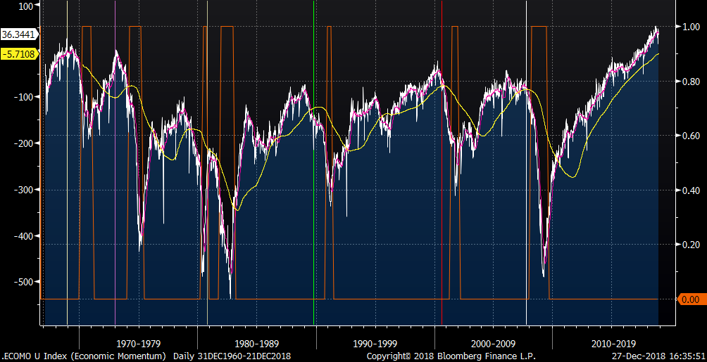
Below is an Economic Momentum, indicator. This is a tracker of high level and frequency economic datapoints of the US. This does a pretty good job of identifying economic trends. Note that the current and recent economic data are still expansionary. But, there is a point to be made that it may be in fact somewhat extended and likely to slow down significantly. One could argue that this may be the context that the FED was thinking about.
• The Orange lines are past recessions.
• The Vertical lines are previous S&P500 market highs
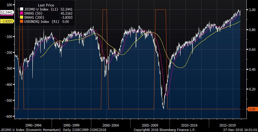
…and this is the same indicator while including “current credit conditions” specific to C&I loan tightening conditions. This is our preferred version but the dataset only goes back to 1989. An interesting observation is that this graphic really captures the extent of the "Credit Crisis" fulcrum of the GFC.
(All charts courtesy of Bloomberg, LLP)
As always, we are happy to discuss any and all of this with you at your convenience.
Comments