The slope of the yield curve informs about the future state of the economy. Post the great recession, the yield curve hasn’t tracked always the “normal” cycle shown in Figure 1. There are two reasons why this is the case and what it means for core fixed income investing.
Figure 1: U.S. Treasury and Japanese Yield Curve Compared
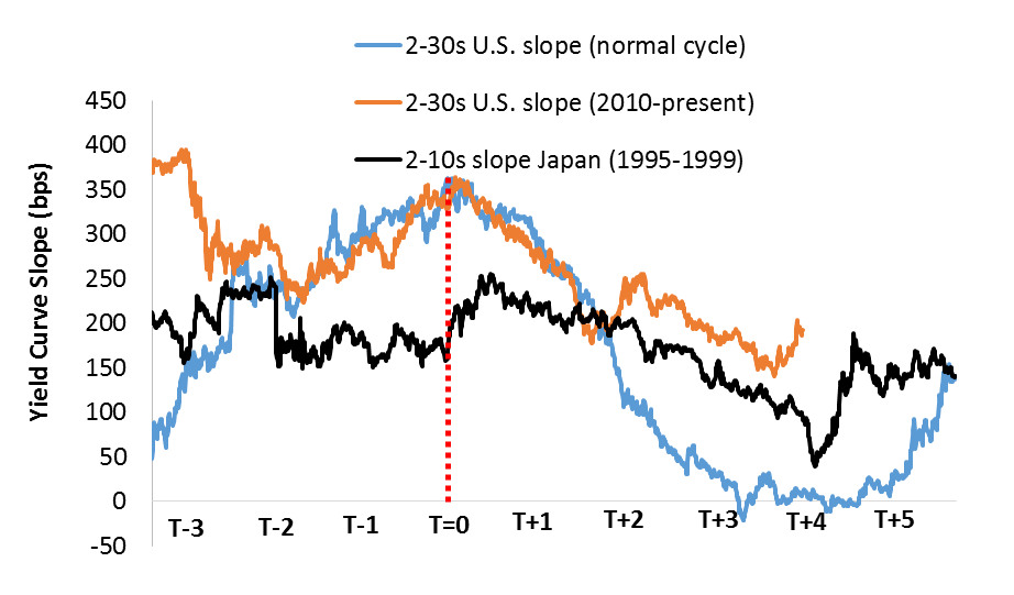
Source: Bloomberg, monthly data. T-= years before the cycle peak of economic growth, T+ = years post peak and into recession.
The first reason is to compare the slope of the U.S. yield curve to Japan. The Japanese curve followed the normal cycle but deviated when deflation took hold (T+2 to T+4, Figure 1). Notably, the U.S. yield curve (orange line) follows the Japanese curve (black line). The background story is a decline of potential output accentuated by advancing demographics.
The effect of these secular forces was after an initial sharp fall, Japanese interest rates wandered below a “ceiling” of 2 percent as shown in Figure 2 on page 2. U.S., U.K. and German interest rates have in recent years followed an almost identical path as that of Japanese rates during late 1990s. This phenomenon has been dubbed “Japanification.” Interest rates react with occasional “overshoots” when stimulus is anticipated but fall right back below the 2 percent “ceiling” when stimulus fails to alter potential output.
An important aspect of “Japanification” is the pivot point of deflation. In the late 1990s, through a combination of passive monetary policy and active fiscal policy, Japanese deflation expectations became entrenched. Despite current hope and enthusiasm, Figure 2 suggests the potential longer term positive effect of fiscal stimulus are disputed as bond markets may have passed the point of deflation during the summer of 2016, impacting inflation expectations structurally.
Figure 2: “Japanification”
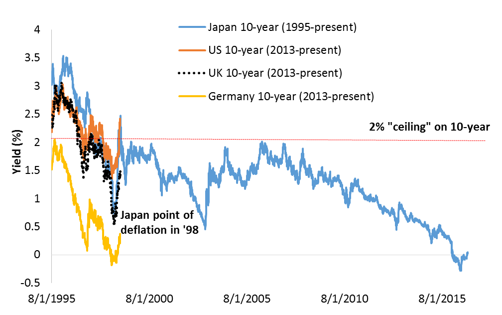
Source: Bloomberg, monthly data, 1995-2016
To that effect, inflation expectations can be impacted by the relationship between the U.S. and Japanese “inflation break-even curve”, explained in Figure 3. When the oil curve flattens, short term inflation expectations rise due to sensitivity to energy prices, flattening the inflation break-even curve. When the oil curve steepens, long term inflation expectations move up due to higher oil forward prices, and the inflation break-even curve steepens.
This relationship can be compared to Japan where the inflation break-even curve has been historically flat or inverted (black line, Figure 3). The U.S. break-even curve followed Japan with a flat term structure, which can imply inflation expectations remain below 2 percent target for a prolonged period.
Figure 3: Oil Curve and Break-Even Curve
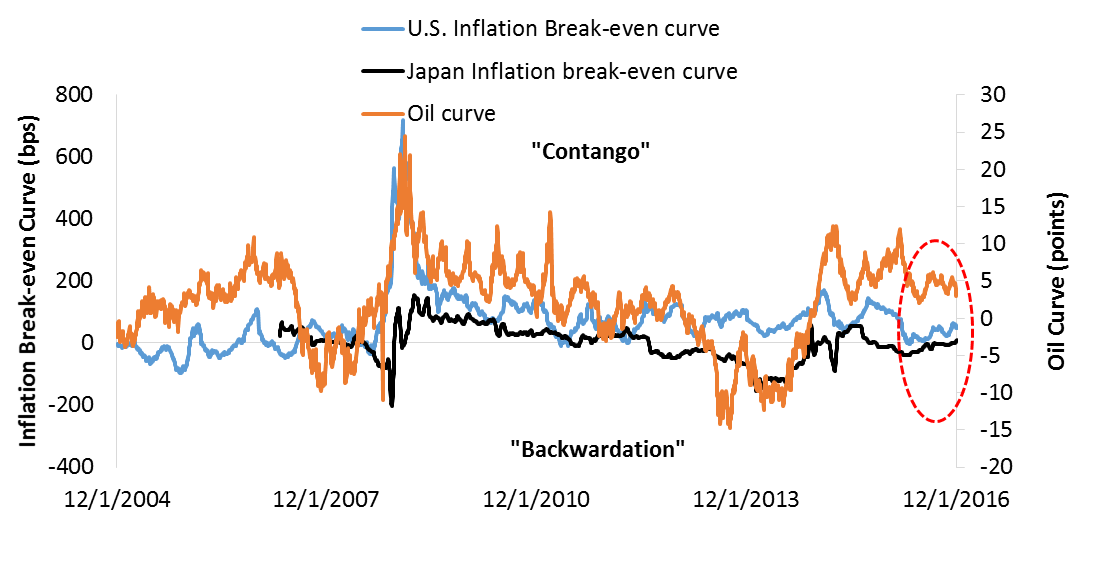
Source: Bloomberg, daily data, 2004-2016. Oil Curve = price of 13th oil futures contract (forward) – price of 1st oil futures contract (spot). Inflation break-even curve = 10-year break-even – 2-year break-even. In case of Japan, generic inflation swaps were used with history only back to 2007.
Conclusion
For a basic core bond portfolio the analysis from Figure 1 through 3 suggests the following:
1.Historically, risk adjusted annualized price returns from holding JGBs and rolling down the positively sloped yield curve have been on average in the 3 to 5 percent range.
2.Table 1 shows JGB Sharpe ratios became positive. Notable is how German Bunds and U.S. Treasuries’ Sharpe ratios are gradually turning positive in recent years.
Bond markets having reached new yield lows post Brexit may prove to be an important pivot. If the analysis of Figure 1 through 3 proves correct, any cyclical overshoot in rates offers opportunity to add core fixed income as a diversifier to a broader portfolio. Time can only tell if planned stimulus was timely enough to prevent the bond markets from having passed the point of deflation permanently. So far, low bond yields tell a different story.
Table 1: Sharpe Ratios
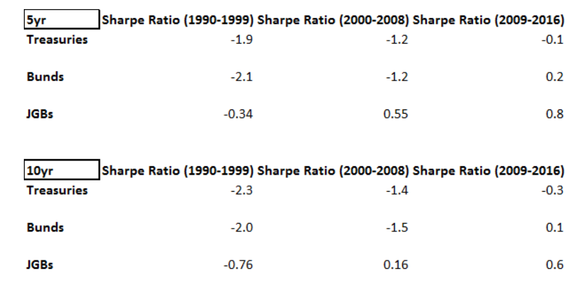
Source: Bloomberg. Monthly data 1990-2016. Sharpe Ratio =Normalized Return - Risk free rate/ standard deviation of return.
Comments